Variant A
Momentum
Crowdfunding energy. Full-bleed hero with title overlaid; bold sticky donation rail is the hero of the page.
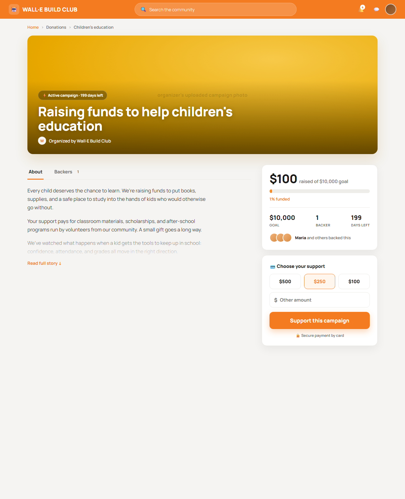
- Most emotional first impression; title + photo + momentum read instantly
- Donation rail visually dominates — strongest "give now" pull
- Backer avatars = live social proof above the fold
- Boldest departure from your current calm system; busiest of the three
Variant B
Story-first / Editorial
Reads like a magazine feature. Serif display headline, generous reading column, calm donation sidebar, impact framing.
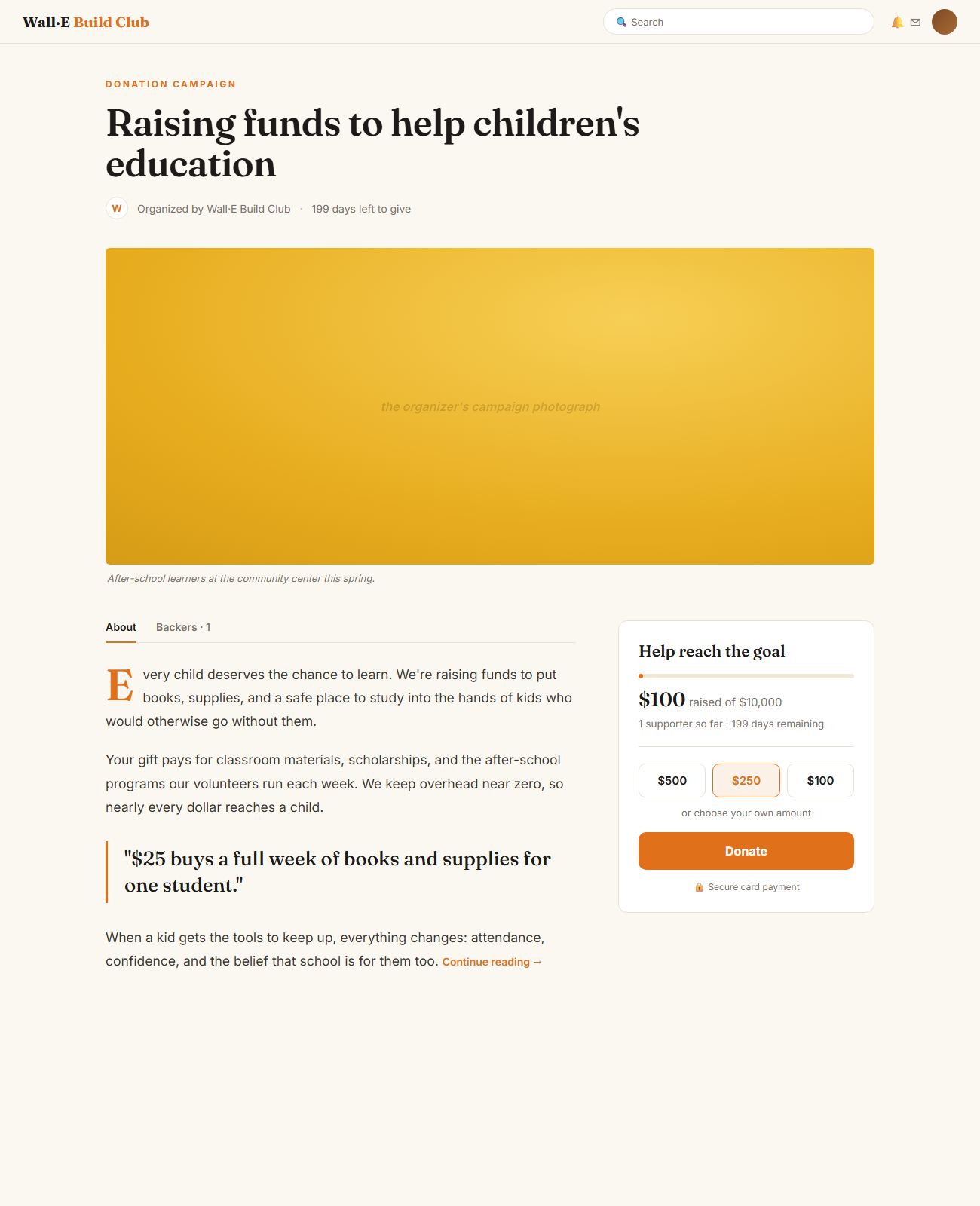
- Best for emotional, narrative causes; donor-empathy tone
- Pull-quote impact line ("$25 = a week of books") drives intent
- Most distinctive typography; feels premium and human
- Donation card is quieter — softer conversion pull; serif may not fit every org
Variant C · system-consistent
Focused Conversion Card
Closest to your Calm Community system. One unified donation card merges progress + amount + CTA; segmented tabs; clamped story.
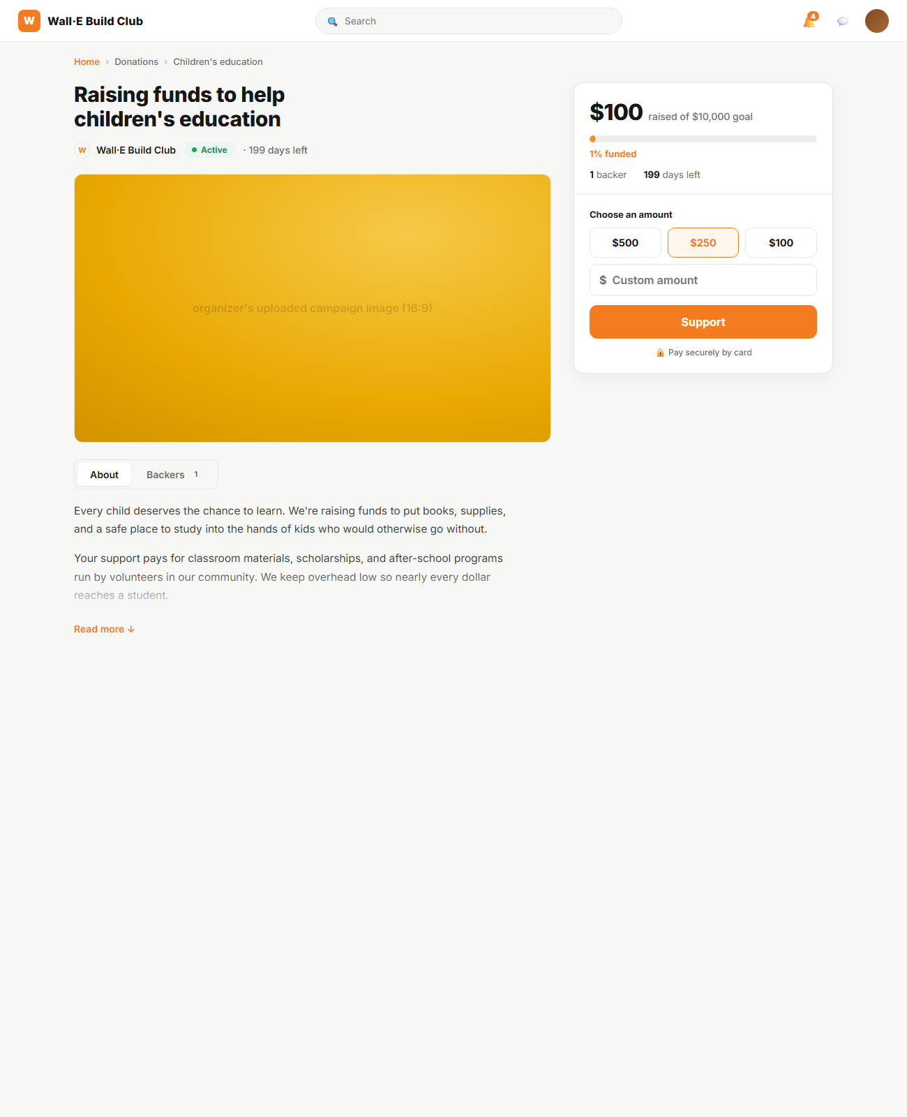
- Cleanest, most uncluttered; lowest cognitive load
- Single unified donation card = one obvious path to support
- Matches existing portal cards/headers — least implementation risk
- Least emotional; relies on the organizer's image to carry feeling